Applying for a data scientist job offer? Tired of writing the same old curriculum vitae?
Why not showing your data visualization skills directly in your application?
Generate Data
Instead of pressing your data about education, employment and skills in a word-like document, put it in tables instead.
E.g. use open office to create and edit csv-files
For this example I’ve created two files: skills.csv and jobs.csv
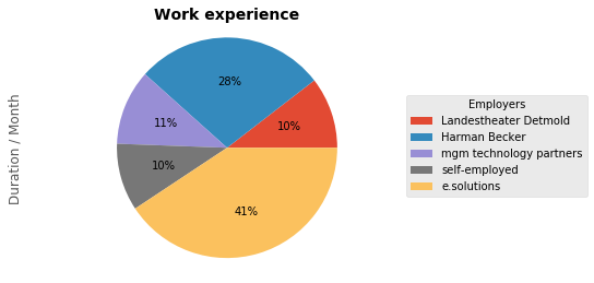
Work experience
import matplotlib.pyplot as plt
import pandas as pd

jobs = pd.read_csv('./jobs.csv')
jobs
| Index | Employer | Duration / Month |
|---|---|---|
| 0 | Landestheater Detmold | 18 |
| 1 | Harman Becker | 48 |
| 2 | mgm technology partners | 19 |
| 3 | self-employed | 17 |
| 4 | e.solutions | 70 |
pie = jobs.plot.pie(y='Duration / Month', labels=None, autopct='%1.0f%%')
plt.title('Work experience', weight='bold', size=14)
plt.legend(labels=jobs['Employer'], title="Employers",
           bbox_to_anchor=(1.2, 0.5), loc="center right",
           fontsize=10,
           bbox_transform=plt.gcf().transFigure)
plt.subplots_adjust(left=0.0, bottom=0.1, right=0.85)
plt.gca().axis("equal")
plt.show()
plt.clf()
plt.close()

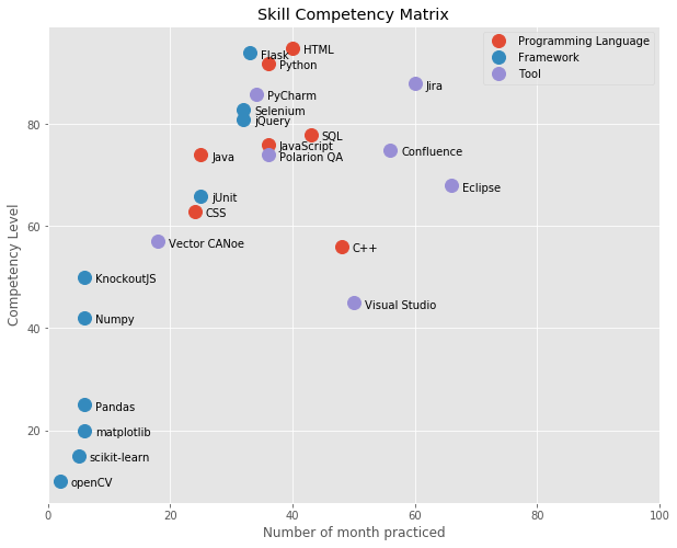
Skill-Competency-Matrix
The idea of the skill-compentency-matrix is to show your competence in your skills in a two-dimensional plot: how long have you been practicing these skills and how confident are you in them.
skills = pd.read_csv('./skills.csv')
skills
| Skill | Type | Number of month practiced | Competency Level | |
|---|---|---|---|---|
| 0 | Python | Programming Language | 36 | 92 |
| 1 | Java | Programming Language | 25 | 74 |
| 2 | C++ | Programming Language | 48 | 56 |
| 3 | JavaScript | Programming Language | 36 | 76 |
| 4 | jQuery | Framework | 32 | 81 |
| 5 | HTML | Programming Language | 40 | 95 |
| 6 | CSS | Programming Language | 24 | 63 |
| 7 | KnockoutJS | Framework | 6 | 50 |
| 8 | SQL | Programming Language | 43 | 78 |
| 9 | Jira | Tool | 60 | 88 |
| 10 | Confluence | Tool | 56 | 75 |
| 11 | PyCharm | Tool | 34 | 86 |
| 12 | Eclipse | Tool | 66 | 68 |
| 13 | Visual Studio | Tool | 50 | 45 |
| 14 | Polarion QA | Tool | 36 | 74 |
| 15 | Selenium | Framework | 32 | 83 |
| 16 | jUnit | Framework | 25 | 66 |
| 17 | Flask | Framework | 33 | 94 |
| 18 | Vector CANoe | Tool | 18 | 57 |
| 19 | scikit-learn | Framework | 5 | 15 |
| 20 | Numpy | Framework | 6 | 42 |
| 21 | Pandas | Framework | 6 | 25 |
| 22 | matplotlib | Framework | 6 | 20 |
| 23 | openCV | Framework | 2 | 10 |
groups = ["Programming Language", "Framework", "Tool"]
fig, ax = plt.subplots()
plt.style.use('ggplot')
fig.set_size_inches(10, 8)

for group in groups:
    skill = skills[skills.Type == group]
    ax.plot(skill['Number of month practiced'],
    skill['Competency Level'], marker='o', linestyle='', ms=12, label=group)
    for i, txt in enumerate(skill.Skill):
        ax.annotate(txt, (skill['Number of month practiced'].iat[i],
        skill['Competency Level'].iat[i]),
        xytext=(10,-5),
        textcoords='offset points',)
ax.legend()
ax.set_xlim(0, 100)
plt.xlabel('Number of month practiced')
plt.ylabel('Competency Level')
plt.title("Skill Competency Matrix")
plt.show()
The plot shows a nice overview of my skills acquired over the years:

Find the Jupyter notebook on github
https://github.com/jboegeholz/curriculum_vitae_for_data_scientists


