When you area already familiar with the basic plot from the introduction to matplotlib here is another type of plot used in data science.
A very basic visualization is the scatter plot:
import numpy as np
import matplotlib.pyplot as plt

N = 100
x = np.random.rand(N)
y = np.random.rand(N)

plt.scatter(x, y) plt.show()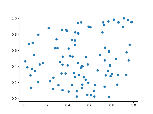
Color of the dots
can be changed with the color parameter. The default is ‘b’ for blue. I f you want e.g. red the color just use ‘r’.
plt.scatter(x, y, color="r")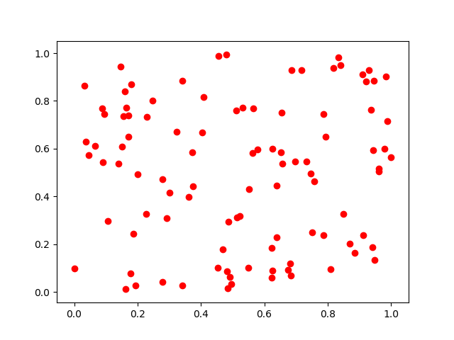
The following table shows the basic colors
| Color | shortcut |
|---|---|
| blue | b |
| green | g |
| red | r |
| cyan | c |
| magenta | m |
| yellow | y |
| black | k (not so obvious :-)) |
| white | w |
In /matplotlib/_color_data.py you find additional colors even colors from XKCD color survey
plt.scatter(x, y, color="xkcd:nasty green")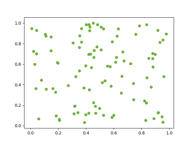
Axis Labels
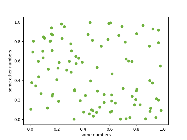
plt.ylabel('some other numbers')
plt.xlabel('some numbers')