Table of Contents
Overview
matplotlib is the workhorse of data science visualization. The module pyplot gives us MATLAB like plots.
You can install it via
pip install matplotlibThe most basic plot is done with the “plot”-function. It looks like this:
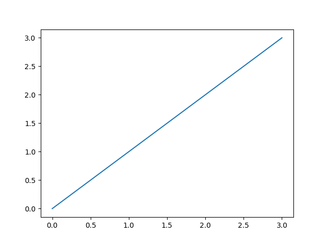
import matplotlib.pyplot as plt
plt.plot([0, 1, 2, 3], [0, 1, 2, 3])
plt.show()
The plot function takes an x and y array and draws a blue line through all points.
You can of course draw each point independently without a line:
plt.plot([0, 1, 2, 3], [0, 1, 2, 3], "o")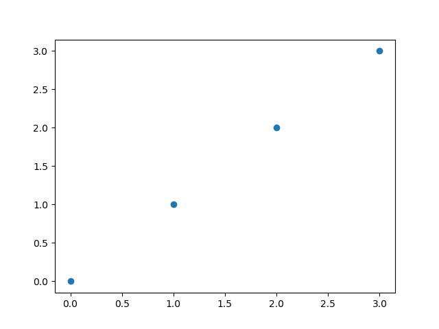
or you can highlight the individual points while drawing the line
plt.plot([0, 1, 2, 3], [0, 1, 2, 3], marker='o')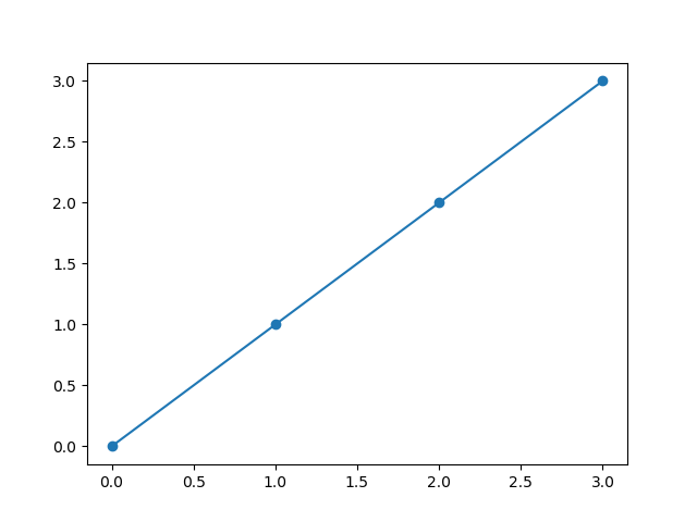
You can find other markers here.
Color of the plot
The color of the line can be changed with the color parameter. The default color of a plot is blue. If you want e.g. red as the color, you can use ‘r’.
plt.plot([0, 1, 2, 3], [0, 1, 2, 3], color="r")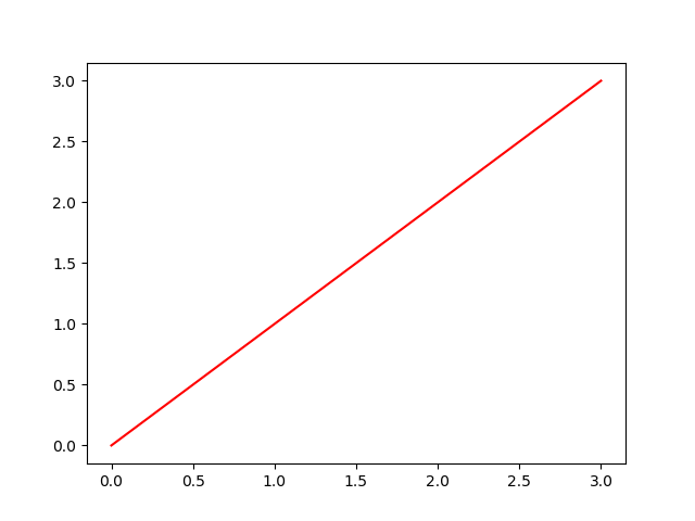
The following table shows the basic colors
| Color | shortcut |
|---|---|
| blue | b |
| green | g |
| red | r |
| cyan | c |
| magenta | m |
| yellow | y |
| black | k (not so obvious :-)) |
| white | w |
In /matplotlib/_color_data.py you find additional colors, even colors from the XKCD color survey results
plt.plot(x, y, color="xkcd:nasty green")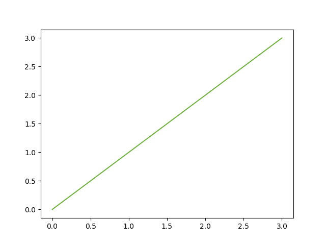
Stroke width and style
changing the width of the plotted line is done via linewidth
plt.plot([0, 1, 2, 3], [0, 1, 2, 3], linewidth=7.0, color="xkcd:nasty green")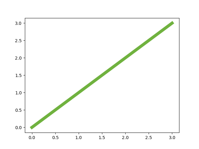
and the stroke style can be altered with the linestyle parameter
plt.plot([0, 1, 2, 3], [0, 1, 2, 3], linestyle=":", color="xkcd:nasty green", linewidth=7.0)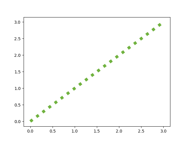
You can find other line styles here
Axis Labels
In school I learned that all axis of a plot must have labels. So let’s add them:
plt.ylabel('some other numbers')
plt.xlabel('some numbers')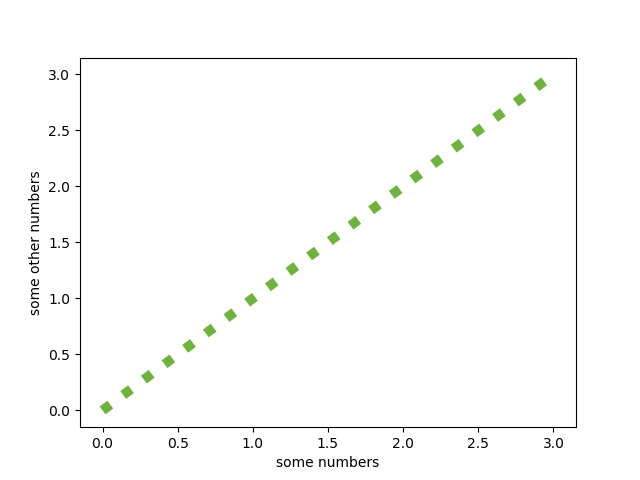
Saving the plot
If You want to save the plot as a png you can replace the show command with
plt.savefig('line_plot_01.png')You can find the code examples in one JuPyter notebook in my github repo
When you’ve become familiar with the basic plot function you can dive into part 2