After laying the foundation in Introduction to matplotlib and Introduction to matplotlib – Part 2 I want to show you another important chart
Bar Charts
A bar chart is useful to show total values over time e.g. the revenue of a company.
years = (2017, 2018, 2019)
revenue = (5000, 7000, 9000)
plt.bar(years, revenue, width=0.35)
plt.xticks(years) plt.title("Revenue over years")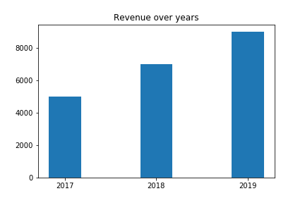
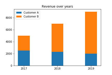
Stacked Bar
years = (2017, 2018, 2019)
revenue_customer_a = (2500, 2300, 2000)
revenue_customer_b = (2500, 4700, 7000)
width = 0.35
p1 = plt.bar(years, revenue_customer_a, width)
p2 = plt.bar(years, revenue_customer_b, width, bottom=revenue_customer_a)
plt.title('Revenue over years')
plt.xticks(years)
plt.legend((p1[0], p2[0]), ("Customer A", "Customer B"))